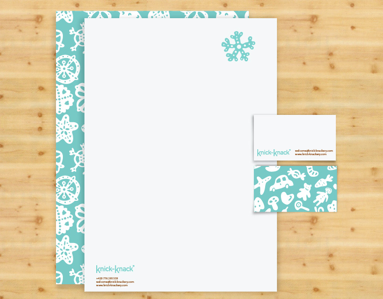
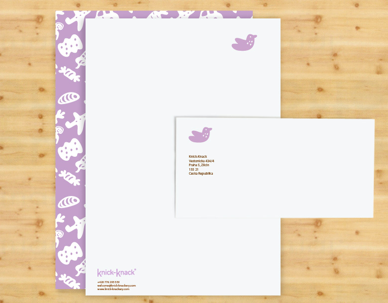
Light mellow identity reflects the entire positive brand’s concept.
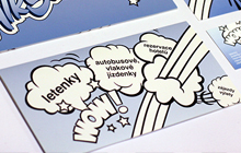
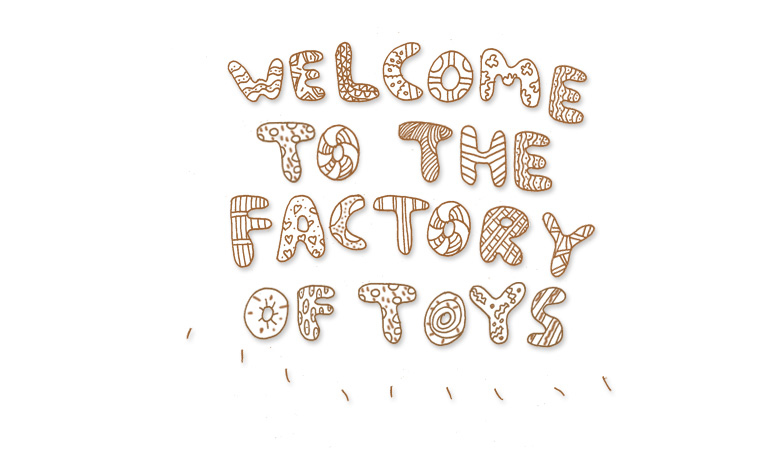
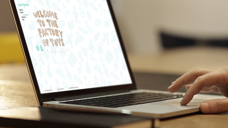
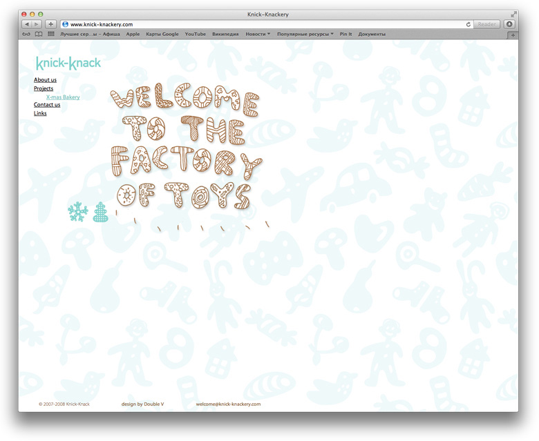
Special fantasy type created for being used in various corporate visuals contributes to the company's common friendly and cheerful image and makes hints about handmade character of the business with its' colour and candy-like shapes.
Special fantasy type created for being used in various corporate visuals contributes to the company's common friendly and cheerful image and makes hints about handmade character of the business with its' colour and candy-like shapes.
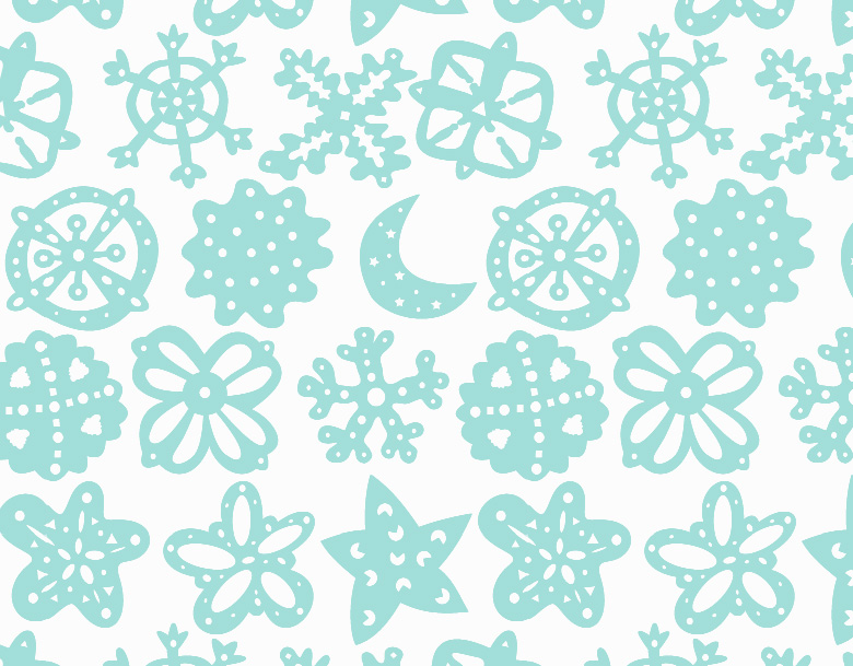
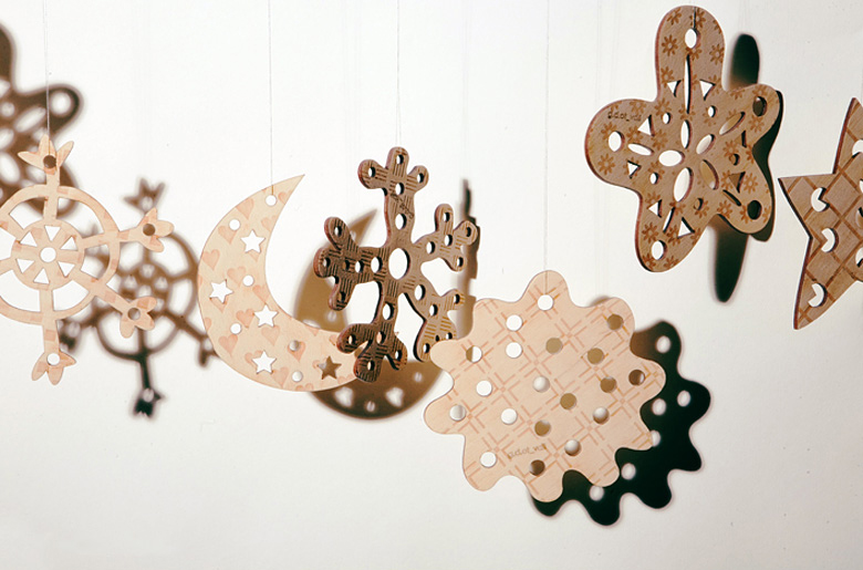
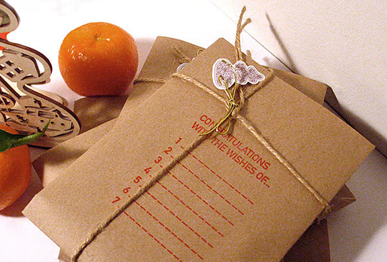
First collection of Knick-knack toys devoted to Christmas theme was released under the special concept of “X-mas Bakery” – the fantasy home manufacture where Mr Knick and Mr Knack are making their holiday dainties which are later on turning into the desidners' souveniers. Collection displays Christmas tree decorations and candlesticks, all handmade and of eco materials.
Knick-knack is a beautiful European designers’ handmade project, which we started to develop from the very “zero” stage. It all began with the idea to launch a soulful and stylish business fitting perfectly in the atmosphere of Prague. Inspired by sweet old European Christmas fairs full of lovely souvenirs, dainties and knick-knackery, we created Knick-knack brand – production of designers’ toys and eco-friendly home decorations. The venture even got its’ legend: two cute cheerful сharacters called Mr Knick and Mr Knack are producing fascinating trifles in their magic factory with marry chatter and light-hearted singing.
We’ve done a lot for Knick-knack: naming, product and packing design, brand associated patterns, logotype and entire visual identity, set of illustrations, website.
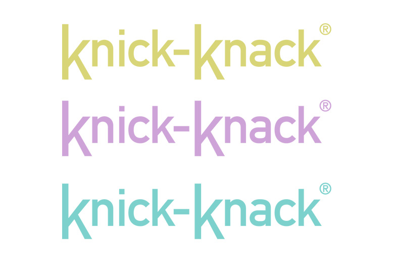
Knick-knack’s logo is graphic-styled. Quiet and clear in its’ lines it feels absolutely harmonious with its’ soft pastel colors in different variations. Two prominent “K” at the beginning of both “knick” and “knack” with clear-cut remote elements look like portraying the silhouettes of the two fantasy brand heroes.
