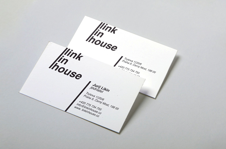
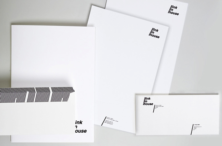
Key ideas used in the logo creation found their course in the entire visual brand concept. Strict black-and-white color spectrum, usage of the core “slash” element in personal cards’ and corporate documentation’s design form a complete image of a modern reliable company providing easy and quick solutions.
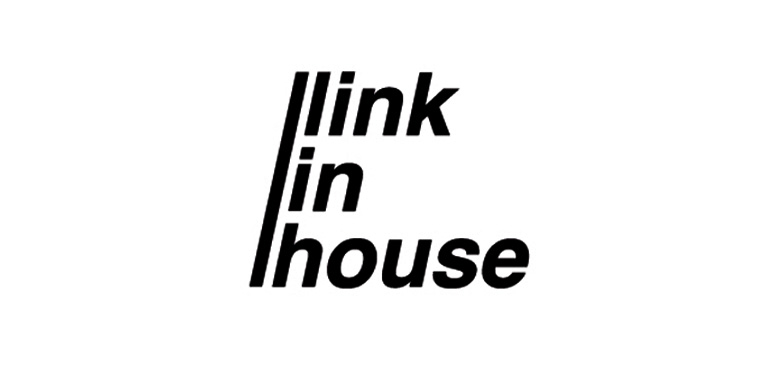
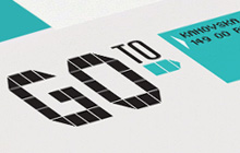
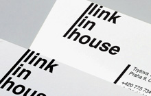
What is the main quality of a good real estate agency? Right, it’s reliability. This particular characteristic we embodied in the straight, crisp, monochrome lines of Link-in-house’s logotype.
The crucial element of the logo’s entire composition is a slanting line looking very similar to the “slash” sign used in the Internet links – a special metaphor telling the company is dynamic in actions, easy to deal with and looking forward to the future.
The crucial element of the logo’s entire composition is a slanting line looking very similar to the “slash” sign used in the Internet links – a special metaphor telling the company is dynamic in actions, easy to deal with and looking forward to the future.